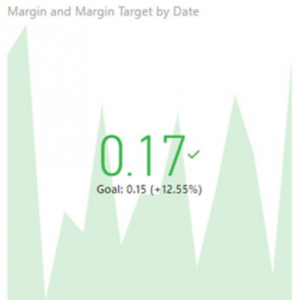
40.
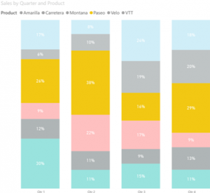
Which of this statements are true about Stacked Column Chart?
I. A stacked column chart is to allow part-to-whole comparisons over time, or across categories.
II. In a stacked column chart, data series are stacked one on top of the other in vertical columns.
III. Stacked column charts can show change over time because it's easy to compare total column lengths
IV. Stacked column charts are good for showing one or two measure’s value across an axis which can be a category or time period.
17. In the context of Data Storytelling, what is a call-to-action?
24. Hybrid titles are multi-functioning titles that play a variety of roles on a visual. Which of the following is included in a Hybrid Title provide?
I. Color Legend for Visual
II. Insightful Information
III. Context of the visual
20. When designing good visuals, we like to consider the overall visual hierarchy. What does it mean?
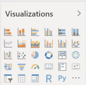
27. Enable column titles. You've imported a spreadsheet, but Power BI Desktop hasn't realised that the first row should be used as column titles. What tool should you click on?
14. What is a Power Bi report?
10. What function is used to generate random numbers between two values?
15. Which of the following is not a measure of central tendency?
22. What is a concern when using a line graph to visualize categorical data?
16.Which term refers to the most common observation in the distribution?
5. If you need to track a single measure in Power Bi, what is the best advance visualization?
25. Which of the following statements are true?
I. Categorical variables should be arranged alphabetically if there is no other logical way of arranging them
II. Categorical variables must be illustrated through the use of a line chart
III. Comparison between different categorical variables can be better displayed through the use of a bar chart as opposed to a pie chart
IV. When attempting to visualize proportion-to-whole of categorical variables, it is generally preferred to use a Tree Map over a Pie Chart
20. Which of the following measures are used to evaluate the strength of a relationship between quantitative variables?
3. What is the comparison operator for ‘less than or equal to’?
15. Which of these tools are not used to explore relationships between two categorical variables?
35.
The above diagram shows an advanced visualization. What it is called?
14. Can you calculate a correlation if there is only one sample of data?
23. Which of the following are reasons for the pie chart being an ineffective method of conveying information? Select all that apply.
- The human eye cannot perceive 2D-Area and angles very well thus making it difficult to compare the value associated with each slice
- Pie Charts are round, and humans prefer rectangular shape
- When there are too many slices (categories) the pie chart becomes difficult to read
- People are used to using pie charts and are bored of seeing them in presentations
13. What type of variables do not take on numerical values?
1. What are the fields that are required to click to show the measure progress in gauge?
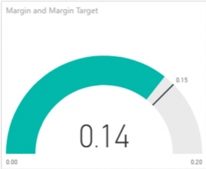
I. Margin
II. Margin Target
III. Tooltip
IV. Country
17. What is the term describing when a cell indirectly or directly references itself?
3. Where are this formula will be entered?
Margin = round(sum(financials [Profit]) / sum(financials[Sales]),3)
13. Which of these types of data does not have an implicit ordering?
16. We want to look up for an exact match of Salesperson based on Customer Name. which of these lookup tables can you use VLOOKUP on?
A
| Customer Name | Salesperson |
| Santa | Prem |
| Xun | Darren |
| Wei | Akmal |
| Claus | Narjes |
B | Salesperson | Customer Name |
| Prem | Santa |
| Darren | Xun |
| Akmal | Wei |
| Narjes | Claus |
C | Customer Name | Santa | Xun | Wei | Claus |
| Salesperson | Prem | Darren | Akmal | Narjes |
D | Salesperson | Prem | Darren | Akmal | Narjes |
| Customer Name | Santa | Xun | Wei | Claus |
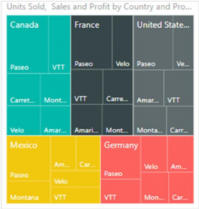
37.
What does the icon above represent?
5. Which function is best to use to combine strings with delimiters?
38.

What is this map above called?
19. Which of the following visuals can be used to visualize proportions-to-whole?
- Tree Map
- Pie Chart
- 100% Stacked Bar Chart
- Donut Chart
8.
What is the name of the visualization as shown above?
18. Good Data Storytelling is comprised of two main elements. What are the two main elements?
21. Scatter plots are used extensively by the scientific community. Why might we use scatter plots?
9. What does the 3 represents in the formula?
Margin=round(sum(financials [Profit])/sum(financials[Sales]),3)
7. What is the difference between the third and first quartile called?
34.
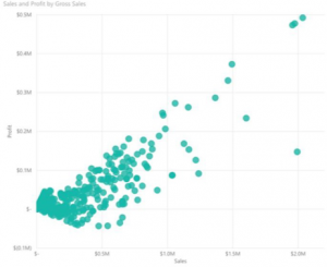
What are the required fields for scatter plot?
I. X-axis
II. Y-axis
III. Z-axis
4. Which of the following functions returns the total of cells in a range that match some criteria?
28. The above chart shows the financial sales of each region. What is the important field that needed to drag into location tab?
6. Which of the following is not a measure of dispersion?
1. What is the comparison operator for ‘less than’?
26. When crafting a data story, it is important to think about the sequence in which we will present individual story points to the audience. One such sequence is to ‘Toe to Head’ approach; that is to start the story with the ending or conclusion. What is an advantage to using such an approach?